
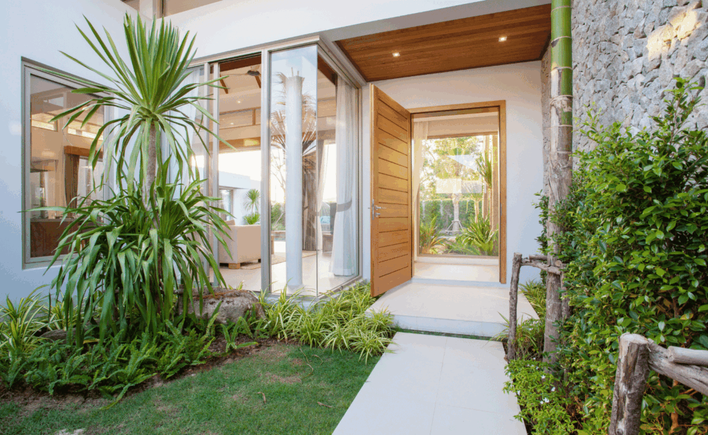
Start with what you can’t change — your roof, stone or brick, and window trim — then pick a body color in the same undertone family, keep the trim two to three shades lighter, and test three finalists as large painted samples on two sides of the house before you buy a single gallon. In Bucks County, where colonial, farmhouse and mid-century homes sit side by side and the tree cover shifts the light through the year, that test step is what separates a color you like in the store from one you like in October.
This guide walks through the decisions in the order a professional painter makes them, so you end up with a color that suits the house, the street and the weather here.
Start with the fixed elements, not the color chip
Nearly every exterior color mistake starts the same way: someone falls for a swatch and then tries to make the rest of the house agree with it. Work the other direction.
Walk to the curb and list everything that is staying: roof shingles, stone or brick, the front walk, any capped or vinyl trim, gutters, and the garage door if it isn’t being repainted. Those materials already set an undertone — usually warm (brown, tan, red, cream) or cool (grey, blue, black, true white). Your body color needs to live in the same family, or the house reads as two unrelated projects.
| Fixed element | Common undertone | Body colors that work | Colors to avoid |
|---|---|---|---|
| Weathered wood or brown architectural shingles | Warm | Greige, mushroom, soft sage, warm white | Cool blue-greys, stark white |
| Grey or black shingles | Cool | Charcoal, slate blue, cool grey, crisp white | Yellow-beige, peach tones |
| Red brick front | Warm, high saturation | Creamy white, deep green, black trim | Pink-beige, terracotta |
| Fieldstone (common on older Bucks County farmhouses) | Mixed warm-grey | Warm white, taupe, muted olive | Bright saturated colors |
| Copper or bronze fixtures | Warm metallic | Deep green, navy, charcoal | Silvery grey-blue |
If you’re unsure whether a material is warm or cool, hold a sheet of printer paper against it. Anything that looks yellow, pink or orange next to the paper is warm; anything that looks blue or grey is cool.
Match the color to the architecture
Bucks County has an unusually wide spread of housing stock, and the style of the house narrows the palette faster than any other factor.
| Home style | Where you see it locally | Palette that suits it |
|---|---|---|
| Colonial / Federal | Newtown, Doylestown, Yardley | Classic neutrals: white, cream, soft grey, black shutters |
| Farmhouse / stone farmhouse | Rural townships, older properties | Warm white, natural taupe, muted green or barn-red accents |
| Cape Cod | Levittown, Langhorne | Light body with high-contrast white trim, shutters as the accent |
| Split-level and ranch | Levittown, Bensalem | Mid-tone greys and greens; avoid pale colors that flatten the long roofline |
| New construction / transitional | Newtown Grant, Richboro developments | Charcoal, greige, navy with black windows |
You don’t have to be literal about period accuracy. But a saturated modern color on a 1780s stone farmhouse tends to fight the building, and a very traditional cream can make a 1990s split-level look dated rather than classic.
Read the neighborhood before you commit
Drive your own street twice — once in morning light, once late afternoon. You’re looking for two things: colors that already work well nearby, and colors used so often that yours would disappear.
The goal is to fit the street without matching your immediate neighbors. If both houses next door are grey, a warm white or a deeper green makes your home distinct while still belonging.
Also check whether you’re in an HOA or a historic district. Several Bucks County boroughs review exterior changes on older properties, and some developments keep an approved color list. Ask before you schedule the work, not after the first coat goes on. Your painter can usually supply the manufacturer name and code the board asks for.
Account for Pennsylvania light and weather
Color behaves differently here than it does in a lit showroom.
- Sun exposure. South- and west-facing walls get the most sun and will look lighter and slightly washed out. North-facing walls read darker and cooler. A color chosen only from the shaded side often ends up two shades paler than expected across the front.
- Tree cover. Mature trees push green into every color underneath them. Greens and blue-greys can turn muddy on a heavily shaded lot.
- Seasons. From November to March the light is flat and grey for weeks at a time. Colors that felt crisp in July can feel cold in January — one reason warm whites and greiges hold up better here than pure cool whites.
- Heat and dark colors. Deep charcoals and navies look excellent on trim and doors, but on large sun-facing wall areas they absorb more heat and fade faster. If you want a dark body color, ask for a premium exterior line with strong fade resistance.
Get the trim, shutters and door right
Most of the character comes from the three-part relationship, not the body color alone.
| Element | Rule of thumb | Typical choice |
|---|---|---|
| Body | Sets the tone; least contrast | Neutral or muted color |
| Trim | Two to three shades lighter or a clean white | Warm white on warm bodies, cool white on cool bodies |
| Shutters | Deeper version of the body’s undertone | Black, deep green, navy |
| Front door | The one place to take a risk | Saturated accent that repeats a hardware or roof tone |
| Garage door | Blend, don’t feature | Match body or trim, never the door accent |
A common misstep is painting the garage door the same bold color as the front door. On most facades the garage is the larger surface, so the accent stops being an accent.
Don’t skip the sample step
This is the step homeowners skip and painters never do.
- Narrow to three candidates from fan decks, not from a screen. Monitors shift color badly.
- Buy sample pots and paint boards about two feet square — not the wall itself, so you can move them.
- Place each board on the sunniest and the shadiest elevation of the house.
- Look at all three at 8 a.m., midday and dusk, and again on an overcast day.
- Hold the sample next to the roof, stone and trim, not against the old paint color, which will bias your eye.
- Give it 48 hours before deciding.
Two days of testing is cheap next to repainting an entire exterior a second time.
Paint quality and prep matter as much as color
The color you pick is only as good as what’s under it. On homes in this area, exterior failures usually trace back to prep, not product: chalking on older siding, unrepaired wood rot at trim and sills, or painting over moisture after a wet spring.
Ask any contractor how they handle washing, scraping, priming bare wood, and caulking before the first coat, and confirm the paint line and number of coats in writing. A quality 100% acrylic exterior paint over correct prep should give you roughly a decade of service on wood or fiber cement siding in this climate, and the manufacturer’s warranty means little if the prep steps were skipped.
Best time to paint here: late spring through early fall, with overnight temperatures staying above the manufacturer’s minimum — usually around 50°F for most exterior acrylics.
Working with a local painting contractor
A contractor who works in Bucks County every week already knows which colors hold up on which exposures, what the local boards approve, and how quickly a west-facing wall in full sun will fade. Ask for photos of recent exteriors, and ask them to spray or brush your two finalists on the actual house before the crew starts.
New Look Painting & Remodeling handles exterior painting, interior painting and deck and patio work across the county, including Newtown, Yardley, Langhorne and Washington Crossing. You can see finished projects in the gallery, call (267) 980-1476, or request a free quote.
Frequently asked questions
What is the most popular exterior paint color in Bucks County right now?
Warm whites, greiges and soft blacks dominate, usually with white or near-white trim. They suit both the older colonial stock and newer construction, and they photograph well at resale.
Should exterior trim be lighter or darker than the body?
Either works, but pick a clear direction. Lighter trim is the traditional choice and makes a home look larger; darker trim reads modern and highlights window shapes. Avoid trim that sits only one shade off the body — it looks like a mistake rather than a decision.
How many colors should an exterior use?
Three is the standard: body, trim, and one accent for the front door or shutters. A fourth color is only worth it on homes with several distinct architectural elements, such as a Victorian.
Do dark exterior colors fade faster in Pennsylvania?
Deep colors show fading sooner on sun-facing walls because the pigments absorb more UV. Premium exterior lines with fade-resistant colorants help significantly, and dark colors on shaded elevations or on trim hold up well.
Can I paint over brick or stone on my home?
Brick can be painted with a masonry primer and breathable paint, but it is effectively permanent — removal is difficult and expensive. Natural fieldstone on older Bucks County farmhouses is usually best left unpainted.
What time of year is best to paint a home exterior here?
Late April through October, when overnight temperatures stay above roughly 50°F and humidity is moderate. Painting too late in the fall risks poor curing.
How long does an exterior paint job last?
With proper prep and a quality acrylic product, roughly 8–12 years on wood or fiber cement siding, and longer on well-maintained vinyl. Sun exposure and moisture drive most of that variation.
